

3 Design Tips
Accessories, Scale and Window Coverings
I love doing Tip Tuesdays on my social media, they are little tidbits of information from a designer to the everyday person who needs help around their home or business. Many of my tips are fun and informational, and I hear from people all over that say “Hey! I have never thought of that!” or “I would have never known that’s a thing.” This is why I do my videos and this blog, to help you! While I would love to be your designer, I know there are plenty of people who decorate and design their own home, so here are my 3 Tips!
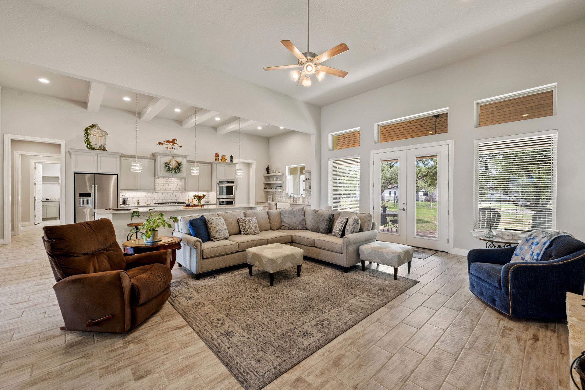
#. ACCESSORIES. I am not an Interior Decorator, but I do design and decorate as needed. I have plenty of clients who need a full room makeover, and that includes accessories. Accessories can include vases, décor, plants, or anything removable that comes in a rather small form. I also, at times, add to their existing décor. This is where I will work with whatever the client has and add in some items. I recently did a home office where they owned the desk and desk chair already, so I added in a decorative server to be used as storage, a loveseat sleeper, and had their mission style chair reupholstered to match the new loveseat sleeper. I decorated the server with a few accessories and I added an end table with a cute lamp.
#2. SCALE. Accessories scale with the surrounding furnishings is very important for balance in your space. If you have a small table, one décor item will work. A small plant or vase for example, would work great. When there is a larger end table, I like to add a lamp, accessory and maybe some coasters or really two shorter accessories, so there are 3 items. With a larger buffet, I add larger scale accessories. A large vase, a large decorative object, a larger plant and that is either in 3’s or 5’s depending on the size. If I do add 5 accessories, then 2 of those accessories will be smaller so there is good aesthetic balance and symmetry. This way the piece has dimension and scale together. It looks balanced and finished!
#3. WINDOW COVERINGS. I have discussed drapes and my love for drapes many times, Haha, but if you are not doing drapes, then there are 2 other good options outside of your standard blinds. Roman Shades and Plantation Shutters. There are tons of different options for roman shades, just like everything else out there. There are fabric-type shades that will never go out of style, bamboo- real or real inspired, and even power motor shades. Roman Shades are an energy-efficient option because they retain heat, and they look so beautiful! Plantation Shutters are also a lovely option. I work with a company that makes amazing shutters, they are fit specifically to your windows, different colors, and different blind sizes. These are so easy to open and close, and not to mention, look so fresh in a home. Shutters will last years and years and add value to your home. Roman Shades and Plantation Shutters vary because of size and material, so choose whichever one you think would work best for you!
These design tips will elevate the spaces in your home or business. These are good tips to have in your back pocket when thinking about or discussing décor. As always, I'm here to help. I do virtual consultations as well, so contact me today!