

3 Things I Would Never Do With Interior Design
3 Things I would never do with interior design- And what I would do instead!
Hello, my fabulous readers, it's Zachary Luke, from Zachary Luke Designs. I'm often asked what are some of the biggest mistakes people make when designing their spaces. Today, I'm going to talk about three topics I would never do with interior design, and what I would do instead.
- Using the Wrong Rug Size for a Space
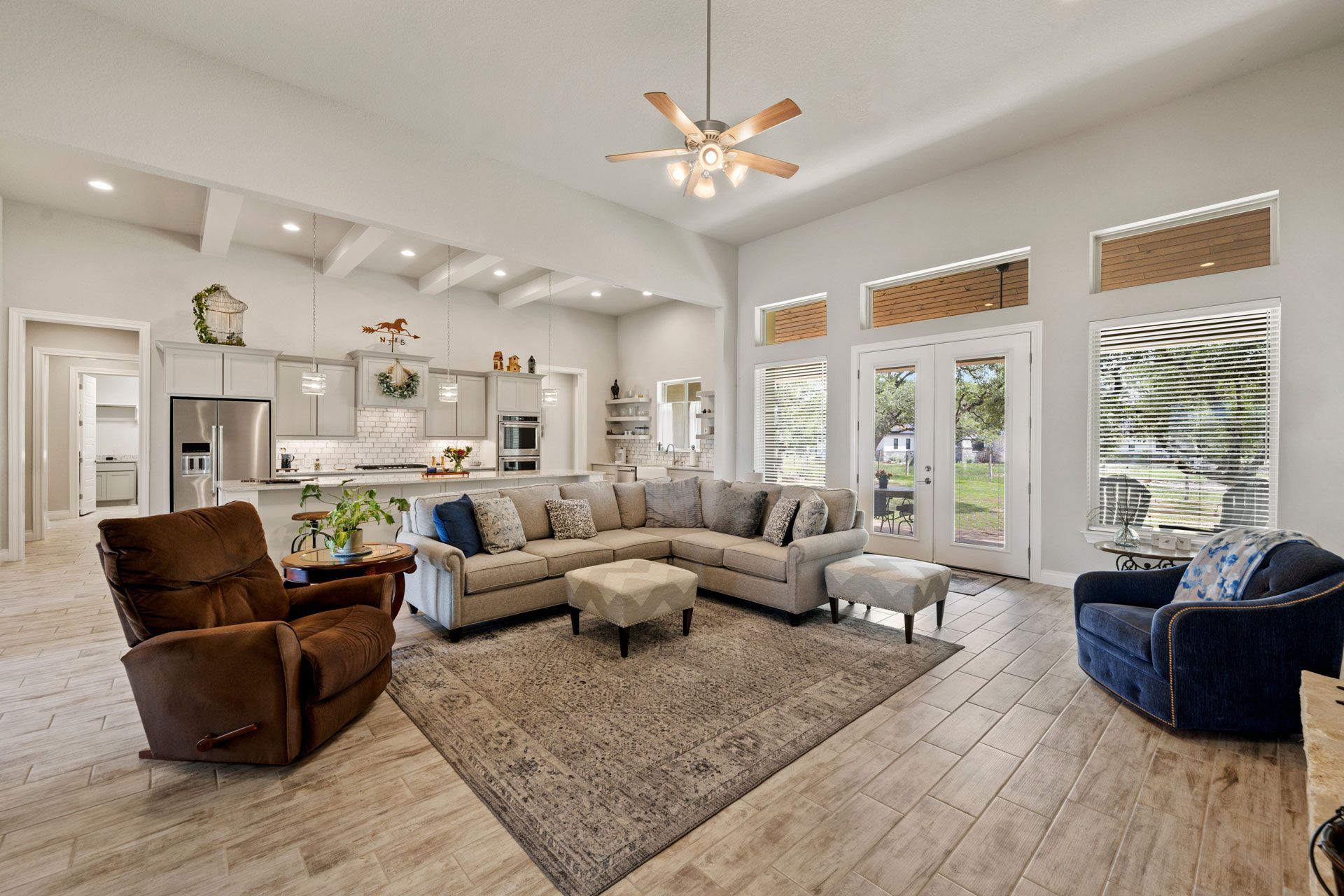
The first on the list that comes to mind is using the wrong rug size for a space. It's a common mistake I see all the time. People tend to choose rugs that are too small for their living rooms or dining rooms, which can make the space feel disconnected and unbalanced.
Instead, I always recommend choosing a rug that's large enough to anchor the space. In a living room, for example, the rug should be big enough so that the front legs of all the furniture are on the rug. This creates a cohesive look and makes the space feel cozy and inviting.
2. Incorrect Lighting for a Space
The second mistake I see a lot is incorrect lighting for a space. Lighting can make or break a room, and it's important to get it right. Too often, people rely on one overhead light to illuminate the entire space, which can create harsh shadows and make the room feel cold and uninviting.
Instead, I recommend layering lighting throughout the space. This includes overhead lights, table lamps, and floor lamps. Also, try adding in some fun, eye-catching light fixtures! By using multiple light sources, you can create a warm and inviting atmosphere that's perfect for relaxing or entertaining.
3. Incorrect Art Sizes or Hanging Heights for Artwork
The third mistake I see is incorrect art sizes or hanging heights for artwork. Artwork can be a great way to add personality and style to a room, but it's important to hang it correctly. I've seen too many people hang artwork too high or choose pieces that are too small for the space.
Instead, I always recommend choosing artwork that's the right size for the wall. When hanging an oversized piece, try hanging it inline with the window frame. If you are working a large wall for your art piece, hang the artwork to mimic the shape of the window instead of lining it up exactly. This creates a focal point in the room and makes the space feel more polished and put together.
In conclusion, these are three items I would never do with interior design, and what I would do instead. By avoiding these common mistakes, you can create a space that's beautiful, functional, and uniquely yours. As an interior designer, I believe that everyone deserves a space that reflects their personality and style. So, go ahead and get creative, and remember to always have fun with your interior design!