

Maximize your Homes Potential
Go from white and neutral to bold and beautiful
When it comes to maximizing your home’s potential, that isn’t just your storage space, but also what can you do with your space to make it great. Whether you’re in a tiny apartment, condo, townhome, single family home, and beyond, there is always MORE you can do to get the best quality out of your space. If you already have a maximalist design style, this blog isn’t for you. Haha! I am not a maximalist designer, which is defined as abundance and excess. You’ve heard the term ‘More is More’ which contradicts a minimalist approach, less is more. This is about maximizing the potential or your SPACE and design.
Starting off with neutral rooms. The kitchen is white. The cabinets are white. The walls are white. The bathroom and closets are white. This is pretty much expected in new builds and new complexes. You know that typical builder grade white and grey. Honestly it is fresh, but basic, nothing wrong with that! My advice coming in with a designer’s eye is forever asking, what can we do to spruce up this space? There are larger projects like replacing the counter tops with a quartzite, quartz, or granite. Replacing the basic backsplash and tiling a walk-in shower with larger more unique tiles. Yes, yes subway tiles are fine, but at least make them a bit larger and with some kind of texture! There are so many ways to use eye-catching, unique designs to bring more personality into your home.
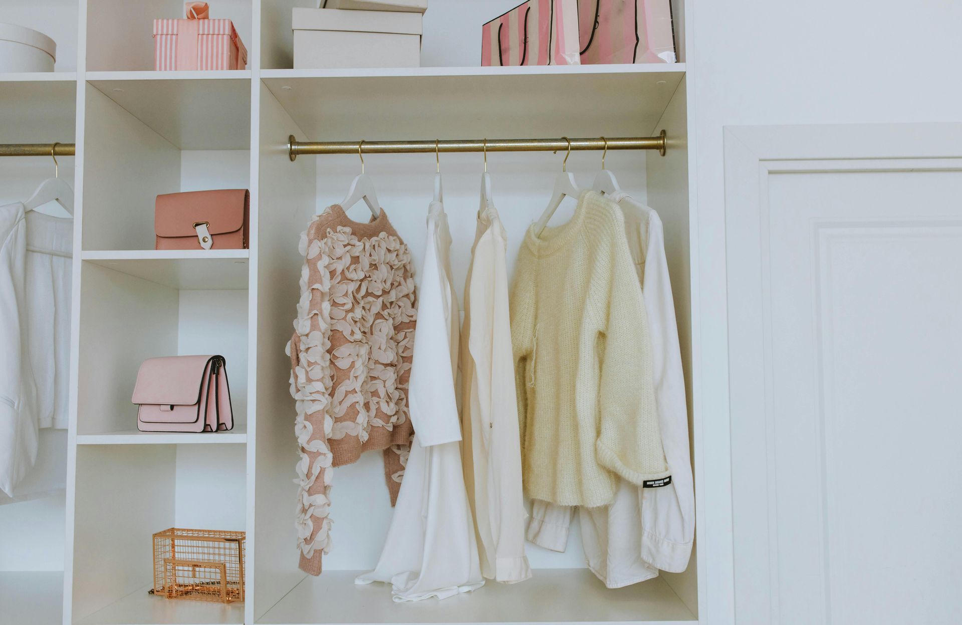
Some other ways to maximize your space is the use of color. I have been reiterating Pops of Color coming back into design finally! Even though the beige neutral style is still here and probably will always be, that doesn’t mean you can’t use color! A closet and a powder room are great places for wall coverings. A funky wallpaper never hurt anyone! I love to add color to bathrooms and offices. Kitchen cabinets and islands are an easy way to add color, if you can do it yourself, great! If not, a designer is here with an expert eye. Other notable areas to mention, hardwood flooring and rugs instead of all over grey carpet or basic gray vinyl plank flooring. Always remember to add in pillows and decor, obviously.
One feature we see neglected is windows. The windows have plain and basic faux wood blinds and that’s it?! Or nothing at all! What do you mean that’s it?! There is so much more-let’s say it together-POTENTIAL. The more expensive, but longevity route is plantation shutters or roman shades, this way you don’t need drapes. If the wooden blinds are here to stay, that’s where drapes or an upholstered valance come in. Adding a sleek rod and patterned drapes will make your space look finished and maximized.
Lastly, FLEX SPACES. The best thing about this is you can do whatever you want! Office, guest room, media room, seating area, kids’ playroom, there are so many options. An area you can have fun and functional is always great to have in your home. A bonus room is a bonus! Utilize this area wisely. Add in a wardrobe and shelving for storage space, a Murphy bed or pull out sofa for guests, and if you have the space, use the closet as a powder room and BAM a fully functioning extra room! Maximize the potential of all of your spaces and watch out for our videos explaining all of the How-To’s.
@ZacharyLukeDesigns on all platforms.