

Breaking Design Boundaries: My Three Hard Passes in Interior Design
Hard passes & their daring alternatives!
Welcome, to the fabulous world of interior design! I’m Zachary Luke from Zachary Luke Designs. I take immense pride in creating spaces that truly reflect the unique personalities and vibrant spirits of my clients. In this blog post, I want to share with you three of my hard passes in interior design, where I break free from the conventional norms and embrace daring alternatives that infuse life and character.
Monochromatic Spaces? No, Thank You! Let's Play with Colors!
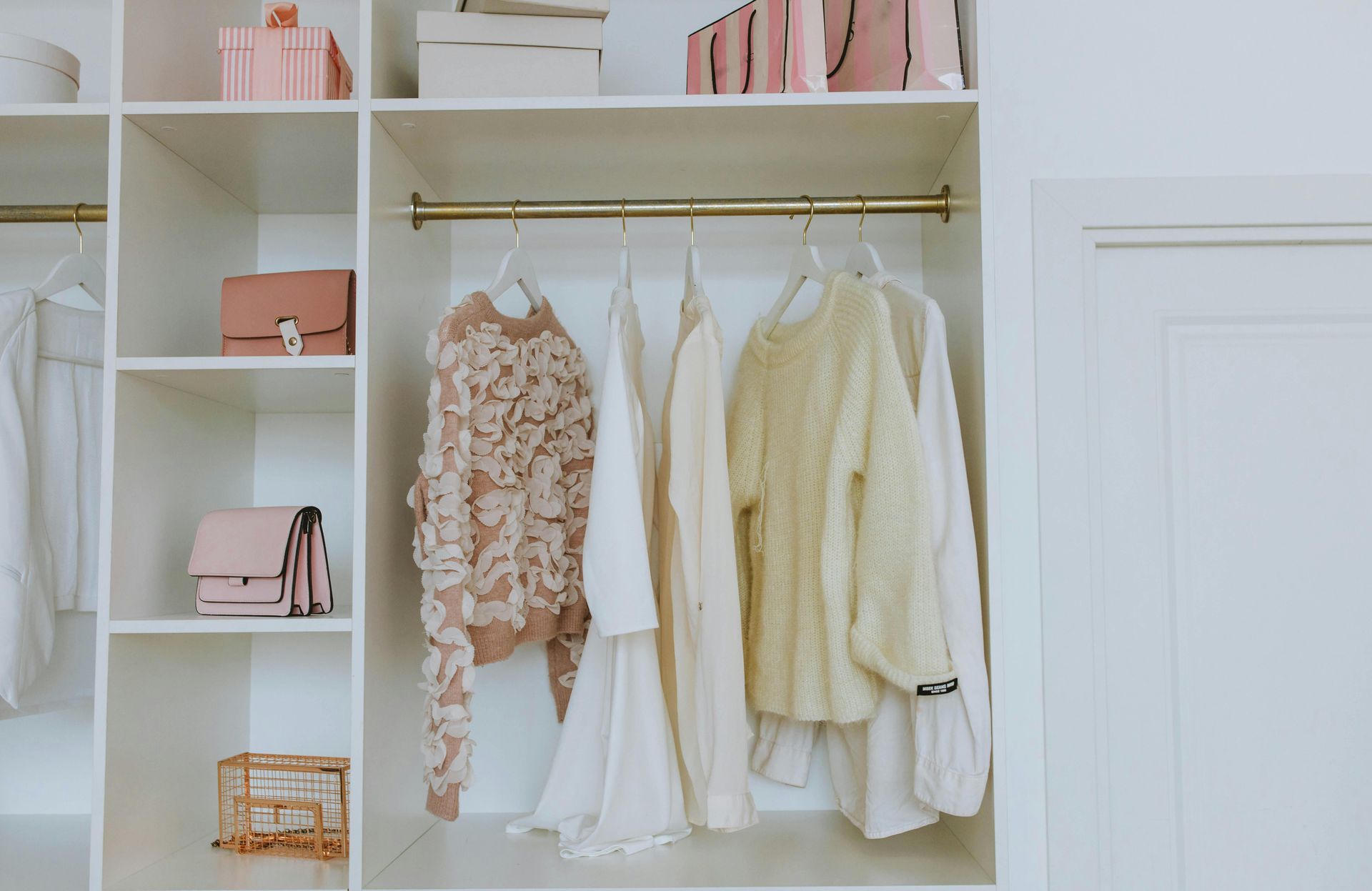
Monochromatic spaces have their charm, but life is too short to limit ourselves to a single hue. Instead of confining my designs to a monochromatic palette, I love to explore color schemes. Colors have the power to evoke emotions, set moods, and create visual interest.
Incorporating pops of color is my secret weapon. Whether it's through vibrant throw pillows, bold art pieces, or playful accessories, I believe in injecting doses of color to enliven a space. Picture a stunning living room with neutral furnishings, where vibrant turquoise throw pillows add to the beauty, or a chic bedroom with a calming palette, accentuated by vibrant artwork.
Marble in the Kitchen? Let's Rock with Quartzite!
Marble has long been a symbol of luxury and elegance in kitchen design. However, my discerning eye tells me that it's time to break free from tradition. While marble certainly has its allure, it's a delicate stone that requires diligent care to maintain its pristine beauty. Enter quartzite, everyone!
Quartzite, a hard stone formed from sandstone and quartz, offers the perfect alternative. With its durability, resistance to heat, and striking natural patterns, quartzite adds a touch of drama and sophistication to any kitchen. Imagine a sleek quartzite countertop in a bold pattern or a statement-making quartzite backsplash that becomes the focal point of the space. Let's rock the kitchen with this stunning, low-maintenance choice!
Goodbye 12x12 Tile, Hello Statement-Sized Stones!
Ah, the classic 12x12 tile, a staple of traditional design. It's time to think bigger and bolder! When it comes to flooring, walls, or even shower enclosures, why limit ourselves to tiny squares? Let's break free from the constraints of size and embrace larger stones like 12x24 18x18, or even larger.
Larger stone tiles not only make a grand visual statement but also create an illusion of more space, especially in smaller rooms. Picture a luxurious bathroom with large-format stone tiles, perfectly accentuated by delicate mosaic accents. The possibilities are endless.
I believe in celebrating individuality and pushing the boundaries of design. By veering away from monochromatic spaces and introducing pops of color, swapping marble for quartzite in the kitchen, and embracing larger stone tiles, we can create spaces that truly reflect our vibrant personalities.