

4 Things In Interior Design That Are.. NOT HOT
What to steer away from, and what to do instead!
Hello, design enthusiasts! It’s Zachary Luke from Zachary Luke Designs, I am here to spill the tea on some design trends that are definitely not hot right now. Our spaces should be a reflection of our unique personalities, and that means steering clear of trends that have overstayed their welcome. In this blog post, I'm going to dish about four design elements that need to take a backseat, pronto!
Vessel Sinks: A Design Trend That's All Washed Up!
Vessel sinks have had their time in the spotlight, but it's time to bid them adieu. While they may have once been considered sleek and contemporary, these basin-like sinks have become somewhat cliché. Let's face it, they can be impractical and high-maintenance, not to mention the splashes that can occur during everyday use.
Instead, let's explore the world of undermount or integrated sinks. These hidden gems offer a cleaner, more streamlined look, seamlessly blending into the countertop. With a variety of materials and shapes to choose from, you can find the perfect sink that adds functionality and elegance to your space.
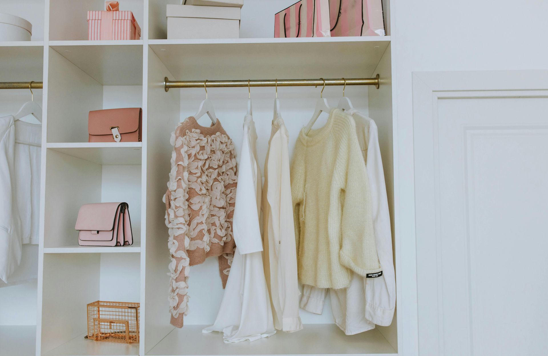
DIY Distressed Decor: Distressing Our Patience Instead of the Furniture!
Ah, distressed decor. It was once a charming way to add character to a space, but now it's starting to feel overdone. While some may argue that distressing furniture creates a rustic, shabby-chic vibe, it often ends up looking contrived or even downright tacky.
Instead, let's explore authentic vintage or antique pieces that bring a unique story and character to your space. Invest in quality craftsmanship and pieces with genuine wear and tear. This way, you'll achieve an effortless and timeless look that speaks volumes about your impeccable taste.
Barn Doors: It's Time to Close the Barn on This Trend!
Barn doors had a moment in the design world, but it's time to bid them farewell. These rustic sliding doors were once seen as a charming and space-saving solution, but they have become a bit too predictable and mainstream.
Instead, let's explore alternative door options that add personality and style to our spaces. French doors can create an elegant and sophisticated entryway, while pocket doors can save space and provide a sleek, modern look. Embrace unique door designs that make a statement and elevate your space to new heights.
Accent Walls: Let's Step Away from the Drama!
Accent walls were once the go-to way to add visual interest and drama to a room. But, we must remember that design is all about balance. An accent wall can quickly become overpowering and disrupt the harmony of a space.
Instead, let's consider more subtle ways to introduce color and texture. The new accent wall is to accent your ceiling. You can also play with artwork, textiles, and furniture pieces that bring pops of color and personality to your room without overwhelming the space. Create a cohesive design that flows naturally from wall to wall.
In the world of interior design, trends come and go, and it's important to know when to say goodbye. Vessel sinks, DIY distressed decor, barn doors, and accent walls have had their time in the spotlight, but their allure has waned. I encourage you to embrace fresh, innovative ideas and let your unique personality shine through in every design choice.