

Boucle: The Bumpy Road I'd Rather Not Travel
The bumpy road I'd rather avoid in my design journey
Hello! It’s Zachary Luke, from Zachary Luke Designs. I am all about celebrating textures, colors, and patterns that bring joy to our spaces. However, there is one trend that makes me cringe every time it comes into the spotlight: boucle. In this blog post, I'm going to explain why this bumpy fabric trend fails to ignite my design passion. Buckle up everyone because we're about to explore why this makes me cringe.
The Texture That Tickles My Nerves:
Boucle, with its looped yarns and distinctive texture, may be adored by many, but it simply doesn't resonate with me. While some find its tactile quality comforting, I find it overwhelming and even irritating. The pronounced loops create a visual and physical distraction that disrupts the visual harmony of a space.
I believe in creating spaces that feel welcoming, calming, and harmonious. Boucle, on the other hand, adds an element of restlessness that contradicts the sanctuary-like atmosphere I strive to achieve. I prefer fabrics that offer a smooth touch and a serene aesthetic, allowing us to unwind and embrace tranquility in our personal havens.
Maintenance Mayhem: The Highs and Lows of Boucle:
Let's talk about maintenance. Boucle fabrics can be a nightmare to keep in pristine condition. The loops tend to trap dirt, dust, and pet hair, making them a magnet for messes. Cleaning and maintaining boucle upholstery or textiles often become a stressful task, requiring special care and attention.
I encourage practicality and ease of maintenance in our design choices. We deserve fabrics that can withstand everyday life without causing unnecessary stress. Opting for performance fabrics can save us from the constant battle against dirt and grime, allowing us to focus on enjoying our spaces.
Limited Versatility: Boucle's Monotonous Melody:
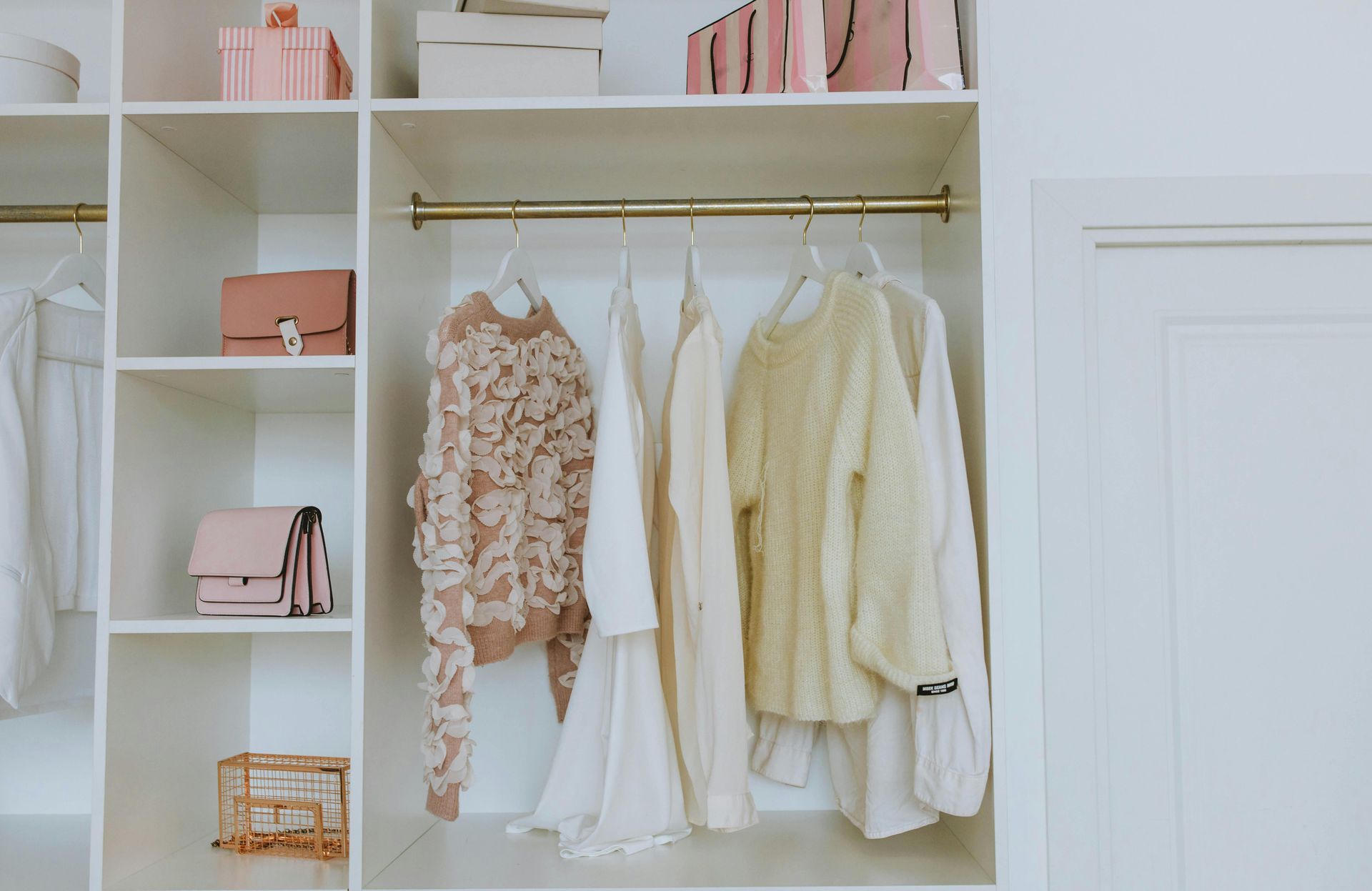
Boucle fabrics can dominate a space and limit design possibilities. While they may add a cozy texture, their distinctive appearance can easily overpower other design elements. Whether it's a sofa, chair, or throw pillow, boucle tends to steal the show, leaving little room for other textures and patterns to shine. The shaved sheep skin looking fabric has no place in my designs.
I believe in the power of versatility and the freedom to mix and match different materials. This allows me to create eclectic and visually captivating spaces. Choosing fabrics with more subtle textures allows us to layer patterns, play with contrasts, and achieve a harmonious balance of visual interest in our interiors.
While boucle may have its devotees, this bumpy road is one I'd rather avoid in my design journey. Its overwhelming texture, high maintenance requirements, and limited versatility simply don't align with my vision of creating serene, practical, and visually captivating spaces. In interior design, we celebrate individuality, and that includes embracing and voicing our preferences. So, if boucle isn't your cup of tea either, fear not! There's a world of design options waiting to be explored, textures that will tickle your senses in just the right way, and fabrics that will make your heart skip a beat.