


Color Popping Guide
Zachary Wheeler • July 12, 2023
How to add pizzazz
Hello, my dear design enthusiasts! It's Zachary Luke, from Zachary Luke Designs, here to talk about one of my favorite design techniques: color popping. If you're looking to add a bit of pizzazz to your room and make it really stand out, then color popping is the way to go. Here are my top tips for adding color pops to your room.
- Start with a neutral base: The first step in color popping is to start with a neutral base. This means painting your walls in a neutral color like white, gray, or beige. This will create a clean slate for your pops of color to really shine.
- Choose your color scheme: Once you have your neutral base, it's time to choose your color scheme. This can be as simple as choosing one or two accent colors to add to your room, or you can choose a more complex color scheme with multiple colors. Whatever you choose, make sure it complements the rest of the room and doesn't clash with any existing decor.
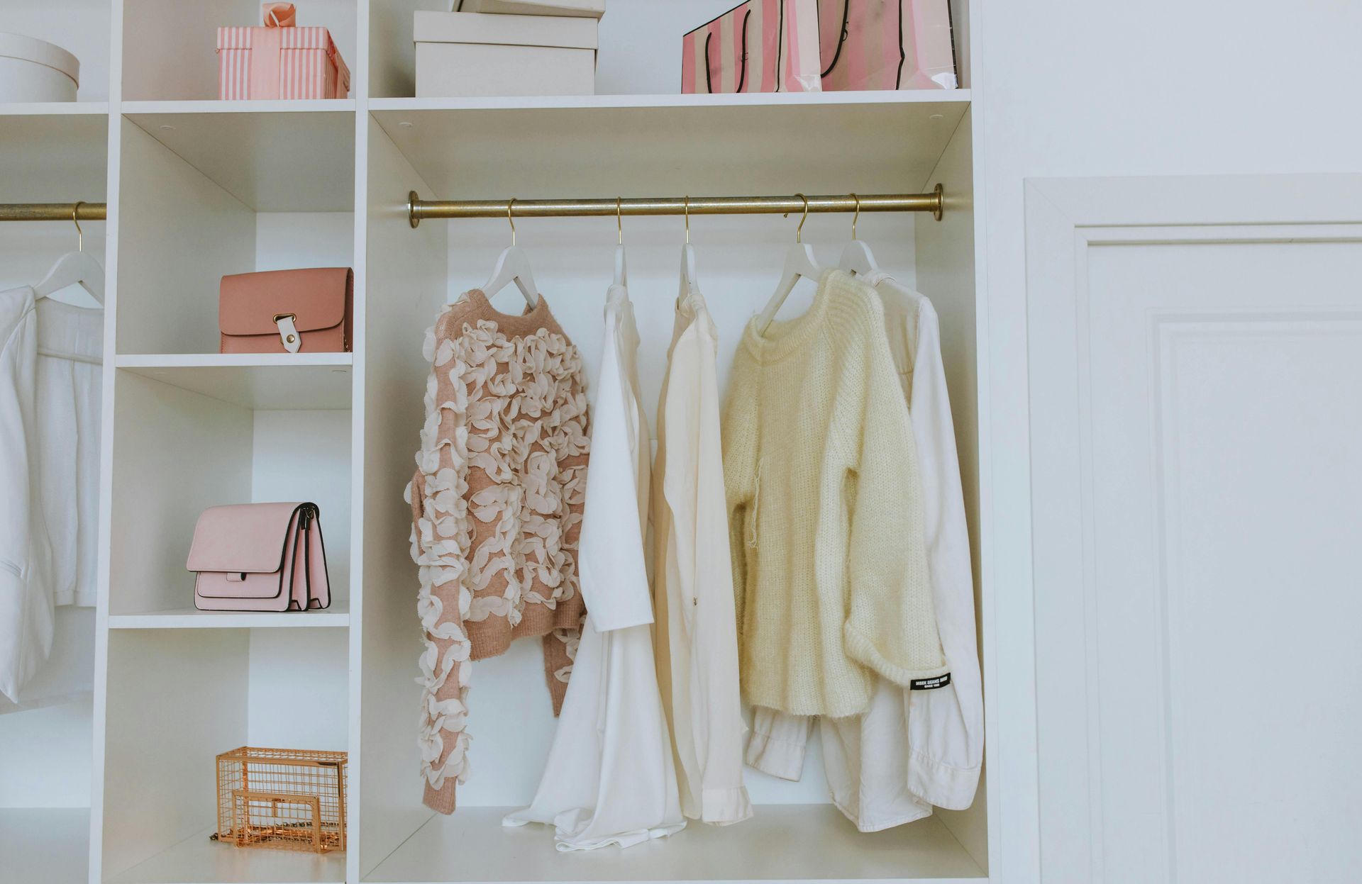
- Use pops of color strategically: When it comes to color popping, less is often more. You don't want to overwhelm the room with too many bright colors, so it's important to use pops of color strategically. This can mean adding colorful throw pillows to your sofa, hanging a bright piece of artwork on the wall, or incorporating a colorful rug into the space.
- Mix and match textures: To really make your color pops stand out, try mixing and matching textures. For example, you could add a velvet throw pillow in a bright color, or incorporate a stone lamp or metal end table into the room. Mixing textures will add depth and interest to the space and help your pops of color really pop.
- Consider lighting: Finally, don't forget about lighting when color popping. The right lighting can really make your pops of color stand out and create a beautiful atmosphere in the room. Consider adding a colorful chandelier or pendant light to the space to really make your color pops shine.
In conclusion, adding pops of color to your room is a fun and easy way to add some personality and flair to your space. By starting with a neutral base, choosing your color scheme, using pops of color strategically, mixing and matching textures, and considering lighting, you can create a beautifully color-popped room that is sure to impress. So go forth and have fun with color, my lovely design enthusiasts!
From Basic to Beautiful
Consultations, Presentations, and more
Go from white and neutral to bold and beautiful