Blog Layout

Fall Interior Design Trends

Zachary Wheeler • October 6, 2023

Interior design 101: Welcome to Fall 2023

Class is in session!

Zachary Luke here to give you 4 tips on how to be on trend for Fall.


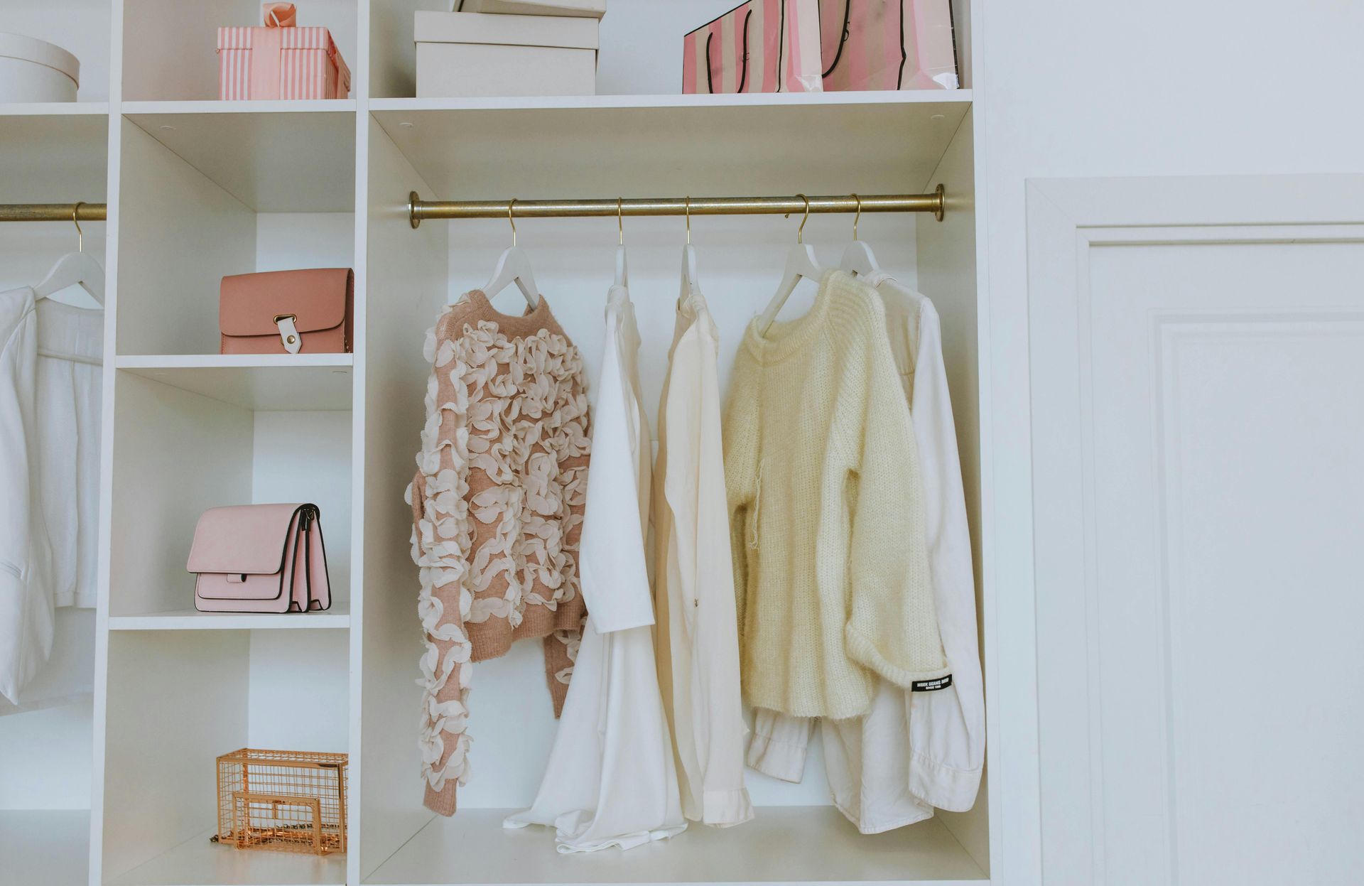
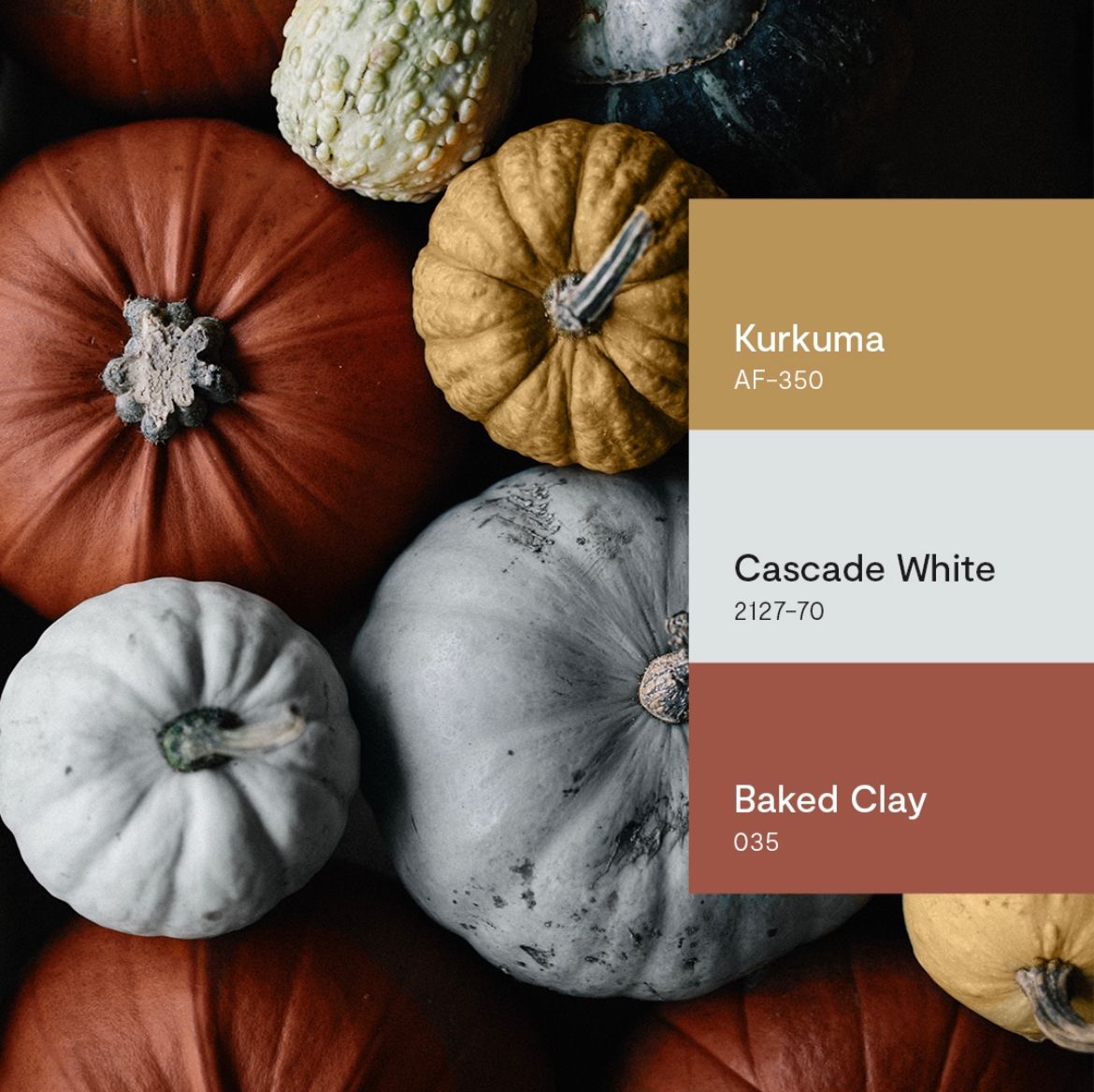
Neutral-earthy tones are staple colors throughout homes and never go out of style. 

If you’re looking to update your paint color, some lovely neutrals are Beiges, creams and off white. You can use these colors for years to come in any room.


Secondly, adding in pillows and throws is such an easy way to decorate your space and be in the autumn mood!

Orange is a wonderful pop of color, along with brown, mustard and olive green for fall. There are so many pillow and blanket options out there to spruce up your space for a cozy fall feel. 


Next, decor decor decor! Everywhere you look right now there are some really cute fall decorations to liven up your space! Along with your neutral walls and pop of color accents, some different colored pumpkins, leafy wreaths, burlap bows, lanterns and candles with yummy fall scents will certainly transform your home to the right vibe you’re looking for!


Lastly, Halloween is just around the corner and now is the time to start decorating! Whether you’re into spooky witches or friendly ghosts, your yard and front steps are ready! Foyers, front doors, and windows are all fun places to decorate for Halloween. Carve those pumpkins and light those lanterns because it’s that time of year.

Have a Happy October!

By Zachary Wheeler February 10, 2025
Go from white and neutral to bold and beautiful
By Zachary Wheeler January 21, 2025
Mocha, Cinnamon, Ruby, Green and more! The main company I use in my business for paint is, Benjamin Moore. I have used them for years and love all their colors, stains, and products. From the whitest white to blackest black, they carry over 3000 colors for all your color needs! Beyond Benjamin Moore, we will touch on other company’s colors of the year. I love POPS of colors in design. Grays and Blues are still my go-to standards, but adding in a pop of color can make your space fun! Benjamin Moore Color of the Year is: Cinnamon Slate They describe this as a mix of heather plum and velvety brown. It is a lovely purple-y hue that would look great in a kitchen, foyer, or primary bedroom. Along with the Color of the Year, they also coordinate a color palette with that. These are colors that will complement each other and can be used together in rooms, like accents, doors, trim, etc. When I accent color, I do not mean an accent wall, just to clarify. These colors include: Rosepine-green/sage, Paris Rain-mint/light green, Sea Salt-neutral grey/white, Glacier White-white hue, Stained Glass-Teal/green, Leather Saddle Brown-burgundy/brown, Chowning’s Tan-Tan/camel, Tissue Pink-Blush pink, & Ashwood Moss-mossy green. Moving on to the other Colors of the Year. Here are my other favorites. Pantone- Mocha Moose A warm rich brown that would be perfect for a big open family room, or in a walk-in closet. HGTV Home for Sherwin Williams- Quietude A neutral green with gray and blue undertones. This would look great on kitchen cabinets or a comfortable sunroom! Behr- Rumors This is a deep ruby red with a bold warmth and would look wonderful in a moody library, home office, or a dining room. If you are looking to update paint in any of your spaces, all these colors would look great. Again, I work with Benjamin Moore, and they have plenty to choose from. I do color consultations often and work those colors into a full design. Get your 2025 started off right, and let’s get to work! 
By Zachary Wheeler January 6, 2025
Hosting another party?
More Posts
Share by: