

Do this, Not that: Renters Edition
Tips to make your guest feel at home away from home
Do THIS not THAT: Renters Edition
Are you currently renting out a property or thinking about it? Well, we have some designer tips for you based on issues we have seen IRL. When you’re thinking of renting out your own home as a second property or an Air BNB, VRBO, etc., you want to make sure you’re giving your guests the best possible stay you can. While you may think that the home looks presentable to your standards, think about how other people will view it. Here are our tips on how to enhance the space to make it look fresh and elevated.
First and foremost, walking into the home what do you notice first? Most likely your walk up to the home and how presentable it is on the outside. If you can’t afford a new paint job or professional landscaping, you can have the home pressure washed. This will make certain your guests know you care about cleanliness. Add a few potted plants and flowers to the front, this will make it inviting and colorful! When you’re walking into the home another item you’re going to notice is the flooring. I typically look at the floors and baseboards to see how well the house has been cleaned. Please do not have old and dingy carpet. While we know this could be a more expensive upgrade, it’s totally worth it to ensure that your guests give you a good rating. The same goes for tile and wood. Having clean and fresh grout and a mopped sparkling flooring is super important.
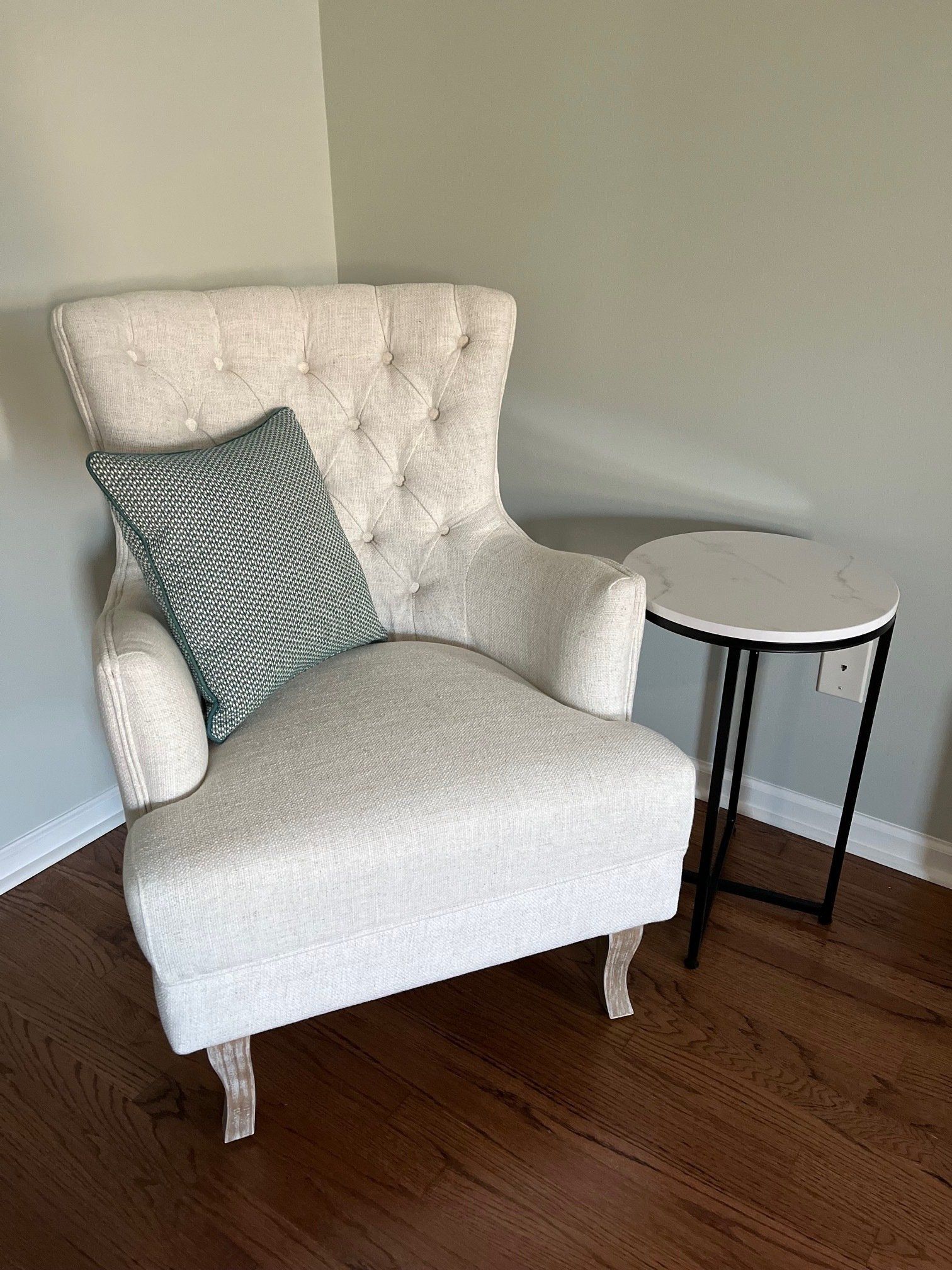
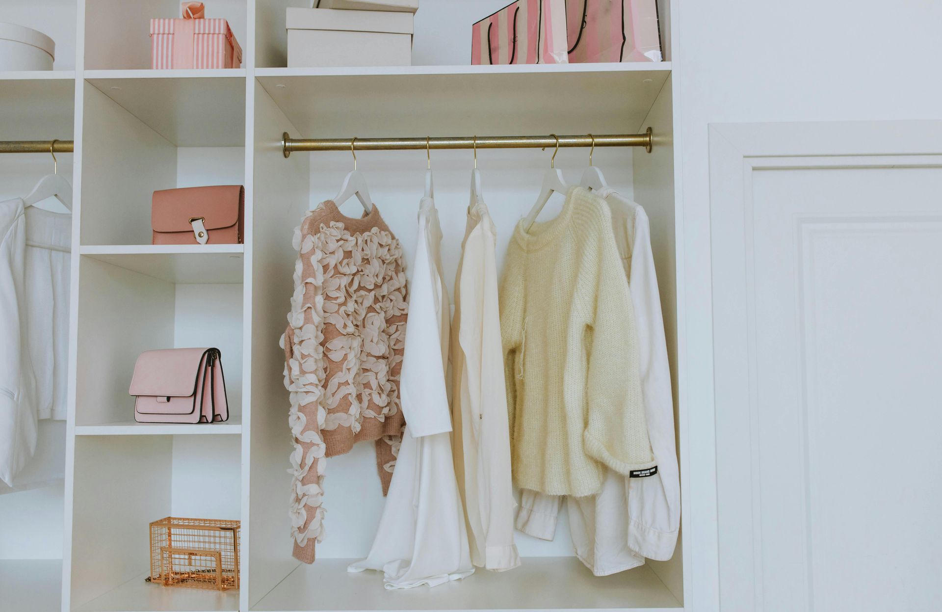
Next, your Guest Rooms. The second place your guests are going to check is the room situation. This means adequate blinds and drapery for privacy. Clean and laundered bedding. We have been to properties with old looking, smelly bedding, and the last thing we want to do is sleep in that bed. I have gone as far as going out and buying new bedding for a week stay at the beach. I was not happy! You want your guests to feel at home, not like they are at an old motel. Some bedside tables and lamps, a nice chair in the corner and fresh towels as well! Your guest rooms should be inviting and comfortable. Please hide the television cords, organize the closets, and have an area for their luggage. These are a few ways to ensure that.
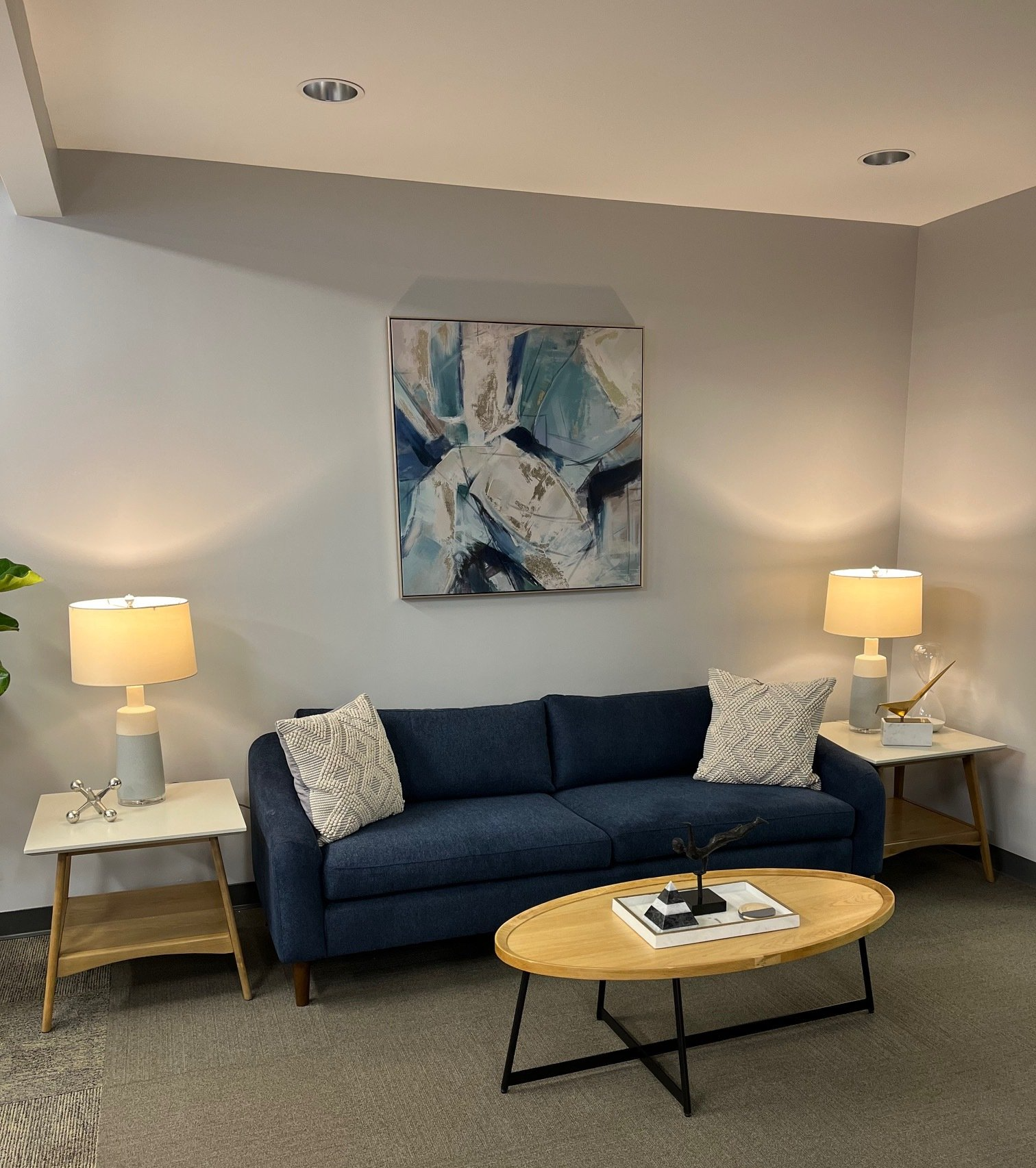
Lastly, Decor and Paint. There is nothing worse than entering a home when it is dark and dingy. Again, you want this space to be inviting. Clean, fresh, and comfortable. Painting a fun or bright color like white, light blue, mint green, or anything that’s happy will do the trick! We have also been to places that are CLUTTERED. Way too many decorations are overwhelming. There is no need for walls and shelves to be filled with junk. Have some cute decorations, like a big mirror in the entry that will open up the space. Some fake greenery for a fresh look. If you want to display some books for them to use, then that’s great too! Hide away the games in cabinets, leave them instructions on what they can use, and where they are located. I promise, just a few simple upgrades like this will make your place so much more inviting and more likely for guests to recommend it to others. Doing all of this will lead to them leaving a good review. There’s nothing you want less than a bad review. So, do THIS and NOT that for a happy rental home.