

Trends
Overwhelming the everyday person with "new trends."
Are you having a hard time keeping up with all of the new “trends” for design each year? It can be overwhelming to see a new trend every time you open social media and influencers saying, “This is the new…xyz.” This can apply to home design, decor, colors, fashion, make up, shoes, etc.! That is out and this is in! Big bold colors are OUT and neutral is IN. BUT WAIT, now neutral is out, that’s boring and drab, and now a pop of bold color is back in. Don’t be boring and neutral, be fun and colorful! It. Is. Exhausting. This can also be confusing because your style is different from another. So, who is right? What style is correct? Who is wrong!?
The answer is no one, not completely anyways.
As a designer, I have my opinions on style, color, and design. I have gone to college and worked in this field for a long time. Style is forever evolving, however, that doesn’t mean your way is the wrong way. This just means our ways are different and typically if we are that different, we likely are not going to be a good team to work together. That’s okay. My style of design is transitional so that way when those colors come in and out of style, your space can still be “in.”
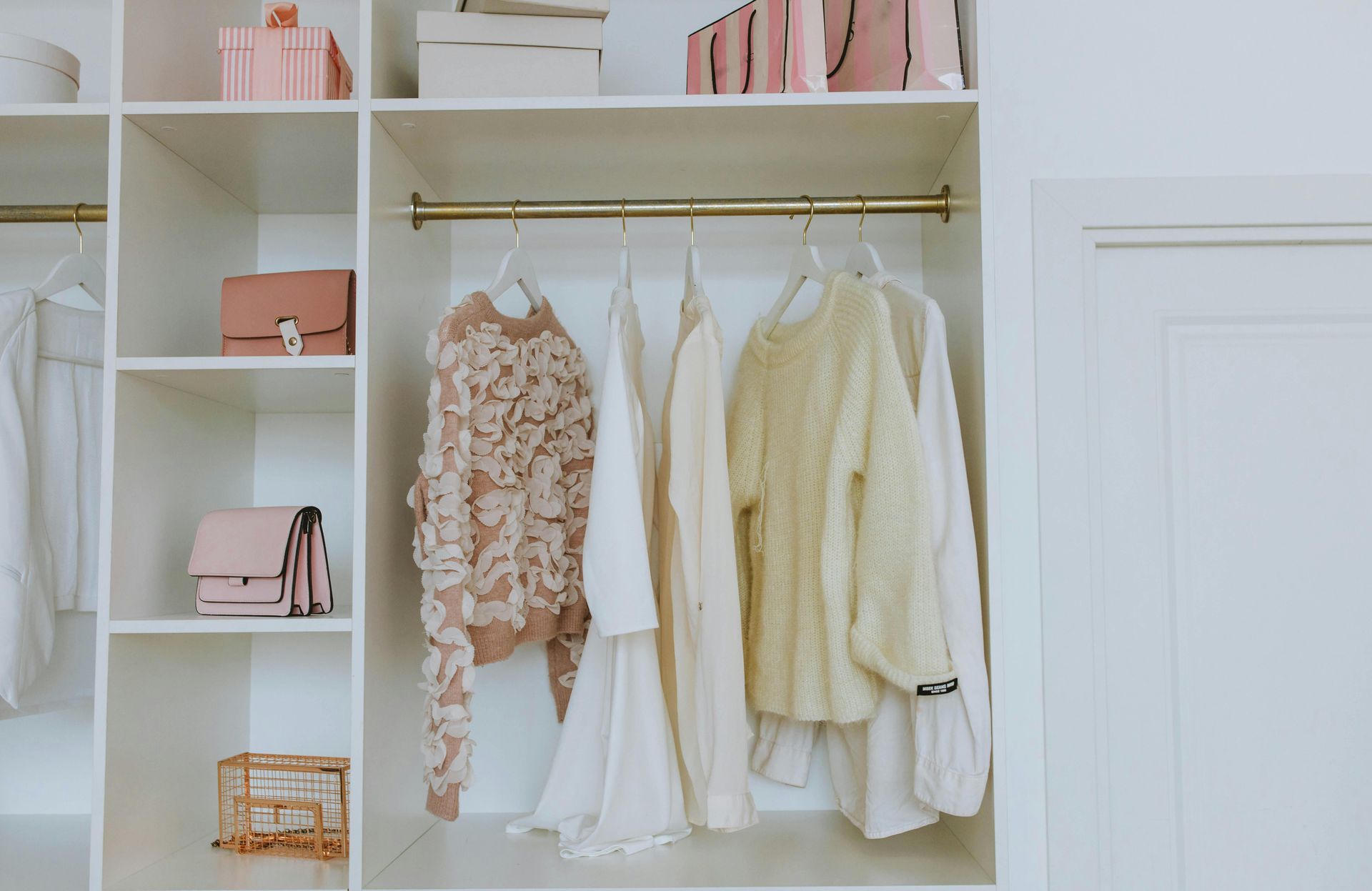
Everyone is saying “millennial gray” is out. And that’s their opinion. I still think a lovely neutral gray is very in. That doesn’t mean you have to have gray walls, gray rugs, gray sofas, and gray drapes LOL. That gray sofa would pair lovely with blues, yellow, or green pops of color! Your gray walls can have a sage green rug and black sofa with silver accents. There are many ways to spruce up your space if you are wanting to stay on trend without redesigning your entire home. As a male designer, my style is also more masculine, but I do love to bring a feminine touch to spaces. My most recent project had blue, gray, white, and neutral as the surrounding colors. I did an amazing crystal chandelier in the entryway that is bold and feminine to tie the space together perfectly. This is a look that is neutral but fresh and updated that will last for years to come. And if they want to stay on trend in the next season as design is forever evolving, then they are free to add new pillows, a piece or artwork, or a fun decorative vase to revamp their space.
We also do not need to get stuck in what is on trend or what’s in for this season. A traditional and classic look will always be in! Now, I can’t say the same for some early 2000’s looks or colors, but that is just MY opinion. Some of you are perfectly happy with your antiques and red walls, haha, and that is just fine. As I always say, you do you boo boo. I just will not be suggesting those design styles as your designer. If you’re asking for advice or hiring me for a project though, please don’t feel offended when I want to make your space more modern and fresher! That is my job after all ;)