

Tips and Tricks Around the House
Mixing and Matching
When it comes to mixing textures and styles there is a correct way to do so. Many times, if there is a piece of furniture that a client has in their home, whether it is a vintage piece or a statement piece, we can make it work with modern design.
I love to mix textures. For example, velvet and linen to glass and metals. I had someone ask about a velvet magenta sofa on social media and how to work that into a design. I would make it the focal point of the room. Everything else around it I would make neutral. And to finish it off, a contemporary coffee table to pull together all the different elements of the space. This is just one example of a tip I gave a client about mixing and matching materials and styles.
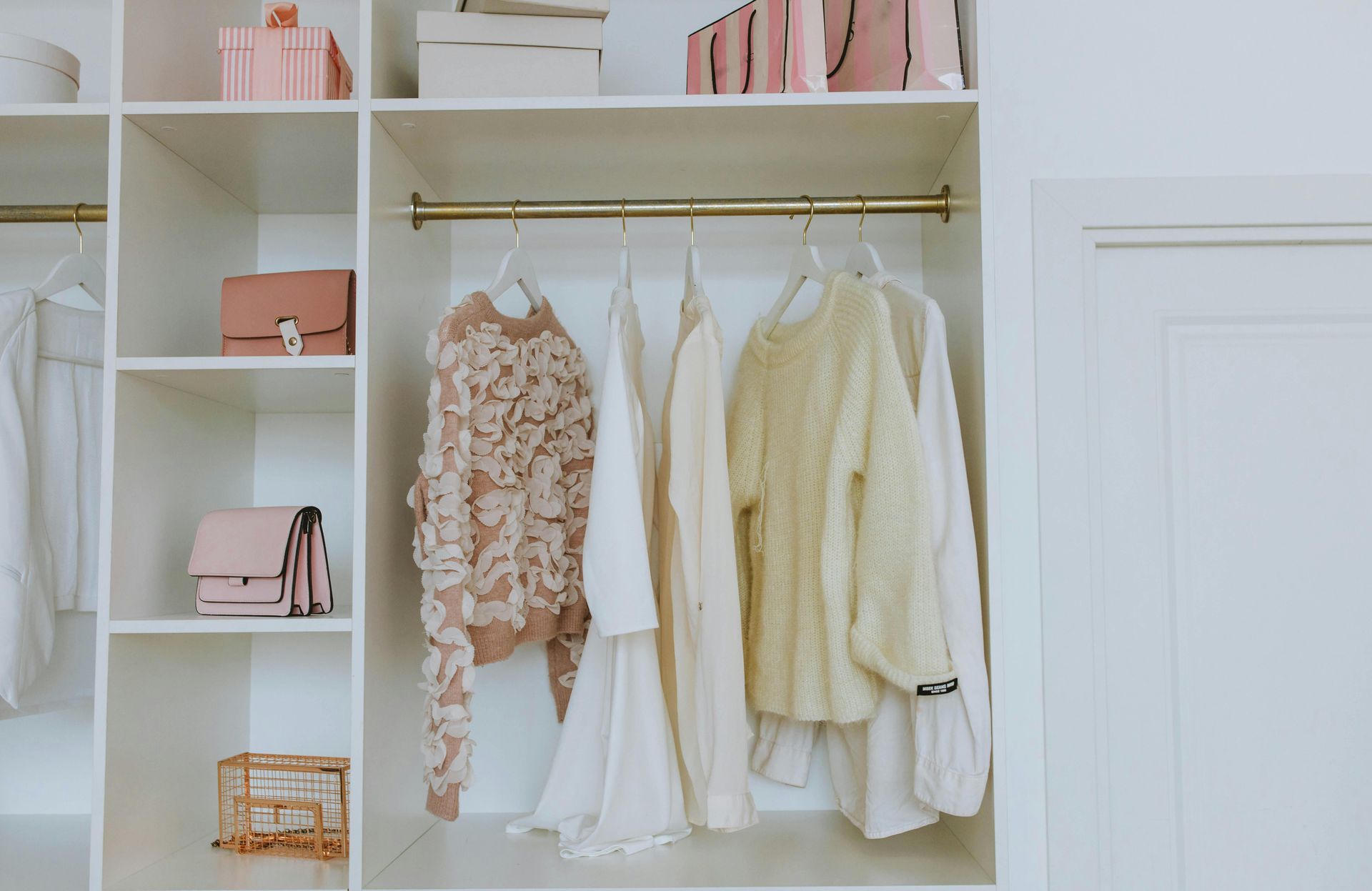
I also recently did a Tip Tuesday about mixing materials in one space, a primary bathroom. This bathroom has textured glass, metal, tile, quartz, and wood. Check out the video on my social media channels. You’ll want to stay with a ‘like’ color scheme. The space will look put together and not broken up. A glass textured light fixture next to a brushed silver metal mirror will look like it goes together, but it doesn’t exactly “match” and we love coordinating pieces. Also, mixing different tiles from floor to wall to shower. You can have 2-3 different tiles in one space if they don’t clash. Different shades of the same color palette will be your best bet!
My style of design is Modern Transitional, which I have gone over before, but that doesn’t mean I won’t mix in pieces from different styles and aesthetics. I can mix modern farmhouse, vintage, mid-century modern, etc. One way I do so is taking a piece of furniture that is, for example, MCM and pairing it with a modern rug that is neutral with a pop of color. To break up the neutrals and play on that pop of color, I would put a standout color on the wall or in a wallcovering. If I’m doing blues, then I would use a teal green or aqua blue wall color. These colors flow nicely together. I would also try to get a similar color in the other furniture in the space so that it doesn’t look out of place. To finish off a space like this, I would add a bold, glam mirror and it would all look fabulous together! I love to keep the vintage feel with a twist of modern updates.
Typically, I like to stay in the modern transitional design scheme by mixing design elements so that they are not “on trend” and will last for years to come. Many times, it is fun to add in a statement piece that I can work and design around to make a space feel fresh. If you have an element like this in your home, then we are more than happy to help you finish off your space the best way possible.